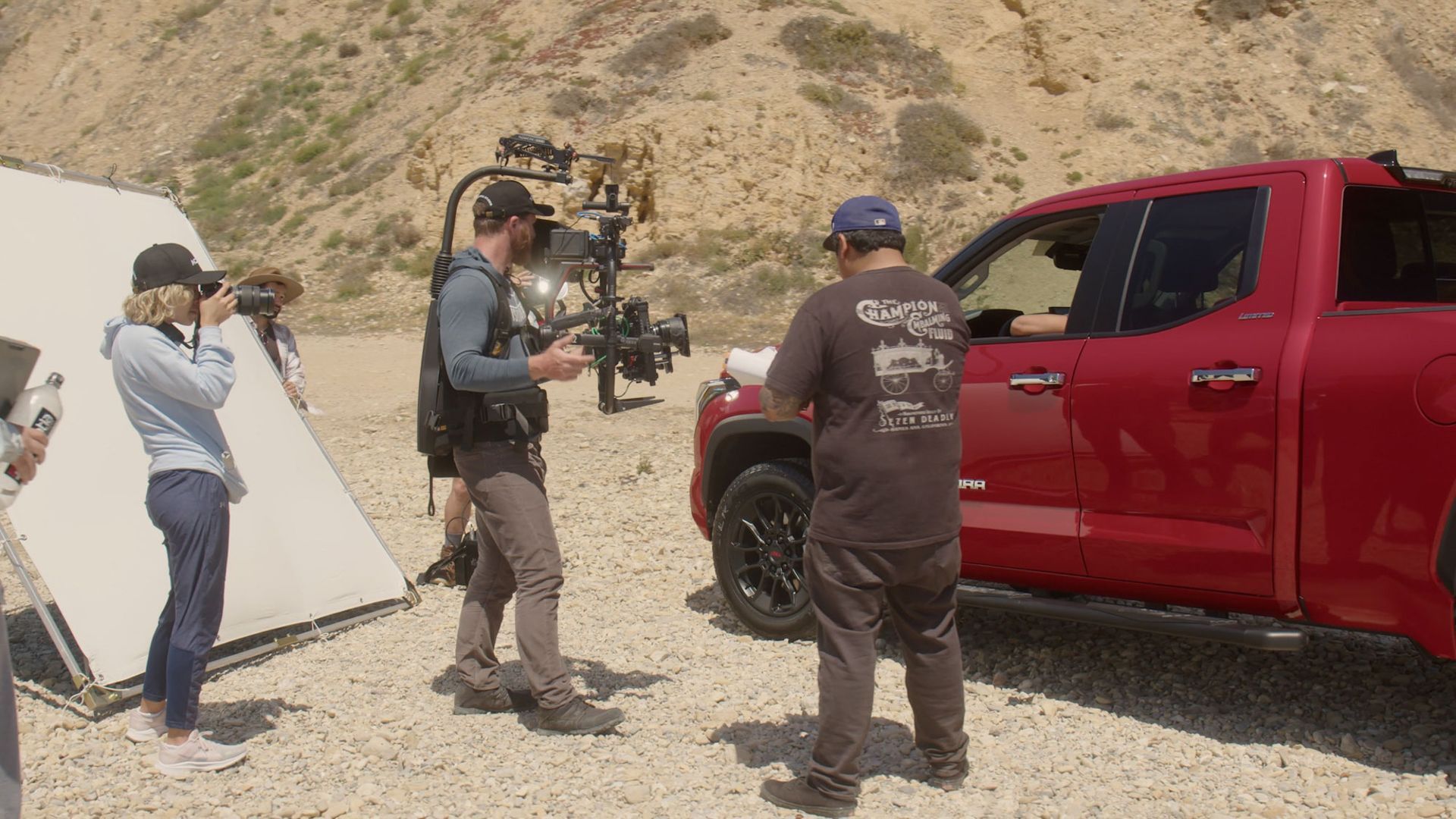
In video production, the power of color cannot be overstated. The human eye is naturally drawn to specific colors more than others, and this innate response plays a pivotal role in the success of our video content. This comprehensive exploration delves into the fascinating world of color psychology, understanding which colors attract the human eye most and how to leverage this knowledge to create captivating and impactful videos.
The Science of Color Perception
How we perceive and respond to color arises from the intricate dance between our eyes and brain. This elaborate procedure centers on the retina, housing specialized cells known as cones, which play a crucial role in detecting and deciphering various light wavelengths. These cones allow us to differentiate between colors and discern the spectrum of visible light.
Colors that Command Attention
Red
The color of intensity and passion. Red is a visual powerhouse, drawing the eye like a magnet. It signifies urgency and often highlights key messages or call-to-action buttons in videos. Whether it's a "Buy Now" button or a critical alert, red ensures it won't be missed.
Yellow
The color of optimism and warmth. Yellow exudes positivity and cheerfulness. It's known for grabbing attention and radiating a sense of happiness. In videos, yellow can bring a smile to your audience's face or highlight vital information.
Blue
The color of trust and serenity. Blue is often associated with reliability and calmness. It's a popular choice for branding and background elements in videos, making it easier for viewers to trust and engage with your content.
Green
The color of growth and harmony. Green is soothing to the eye and symbolizes nature and development. In videos, it can represent eco-friendly initiatives, wellness, or relaxation.
Orange
The color of energy and enthusiasm. Orange is vibrant and energetic, making it an ideal choice for creating a sense of excitement and confidence in your videos. It's often used to stimulate action.
Purple
The color of luxury and creativity. Purple evokes feelings of luxury and creativity. In video content, it can be employed to convey a sense of innovation and originality.
Leveraging Color Psychology in Videos
1. Select Colors with Purpose
Before you choose a color scheme for your video, consider the emotions and messages you want to convey. Are you aiming to create excitement, trust, or a sense of urgency? Tailor your color choices accordingly.
2. Maintain Consistency
Consistency is critical to reinforcing your brand identity. Ensure that the colors you use in your videos align with your overall brand guidelines and message.
3. Experiment and Test
Don't hesitate to experiment with various color combinations to gauge audience reactions. A/B testing can help you determine which colors resonate most with your viewers.
4. Balance and Contrast
Balance your color choices and use contrast wisely. Bold, attention-grabbing colors can be balanced with more subdued shades to guide the viewer's attention and create an aesthetically pleasing video.
The Science of Color Attraction
The Eye's Photoreceptor Cells
At the heart of our ability to perceive color lies the complex interplay between the retina, the light-sensitive tissue at the back of the eye, and its photoreceptor cells—rods and cones.
Rods
Rods are sensitive to light and are the leading players in our vision when light is scarce. Nevertheless, they cannot differentiate between different colors. Their primary duty is to afford us a rudimentary form of fiction in dimly illuminated surroundings.
Cones
Cones, on the other hand, are our color-vision superheroes. These specialized photoreceptor cells are accountable for our capability to perceive and differentiate an array of colors. Three distinct types of cones exist, with each class being sensitive to a particular segment of wavelengths within the visible light spectrum:
- Red cones
- Green cones
- Blue cones
When we gaze upon an object or a scene, the light from that source stimulates these cones within our retinas. The cones send signals to the brain, and it's the brain's job to decode these signals into the rich tapestry of colors we perceive daily.

Why are we more attracted to specific colors?
It all comes down to how specific colors, such as red, interact with our cones.
Red
Red, for instance, has a remarkable ability to stimulate our cones and, as a result, draws our attention with an irresistible force. This color is often associated with urgency and importance, making it a popular choice for highlighting critical video elements. Think of the "Subscribe" button or the "Limited-Time Offer" tag—red ensures they won't go unnoticed.
Yellow
Yellow radiates positivity and warmth, making it an inviting color. This brightness grabs our attention and can convey feelings of happiness or emphasize essential information in videos. It's like a splash of sunshine on the screen.
Color Attraction in Videos
The Strategic Use of Color
Attention-Grabbing Reds and Yellows
Bright and vibrant colors like red and yellow are like visual exclamation points. They demand attention and can be strategically placed to draw viewers into your video. In marketing videos, you'll often find these colors used to highlight critical messages, call-to-action buttons, or flash attention-grabbing graphics.
Soothing Blues and Greens
In contrast, soft and cool colors like blue and green can be harnessed to create a calming and relaxing mood. Imagine a nature documentary where the serene blue of the ocean or the lush green of a forest invokes a sense of tranquility. These colors are often used in videos designed to relax or inspire viewers.
Dynamic Complementary Colors
Complementary colors like red and green sit opposite each other on the color wheel, creating a vivid contrast. They evoke excitement and can be used to energize your video. This contrast is ideal for videos that convey dynamism or make a memorable impact.

Consider Your Audience and Purpose
When selecting colors for your videos, it's imperative to consider both your target audience and the specific purpose of the video.
Children's Content
Consider employing bright and cheerful colors if your video is tailored for a young audience. Kids are naturally drawn to vibrant and playful visuals, so a colorful palette can keep them engaged and entertained. For example, a video teaching children about animals can use a palette of bright, eye-catching illustrations.
Business and Professional Audience
In the corporate world, the choice of colors takes on a more formal and subdued tone. Videos intended for business audiences should use professional and conservative color schemes. Think blues, grays, and blacks to convey trust, reliability, and expertise. These colors can instill a sense of confidence in your message.
Information and Education
If your video's primary goal is to impart information or educate your audience, choosing colors that facilitate understanding is essential. A carefully planned color palette can effectively emphasize vital data points, graphs, and text, enhancing the audience's comprehension of the information you convey.
How to Choose the Right Colors for Your Videos
Color Strategies for Video
Before we delve into the considerations for choosing the right colors, let's revisit the strategies we've discussed for using specific colors in videos:
1. Red for Attention
Red is your go-to color to grab your viewer's attention. It's the visual equivalent of a bold exclamation point. Use red strategically in a title slide, an eye-catching button, or a critical message within your video.
2. Blue for Trust
Blue exudes trust and reliability. It's the color that reassures your viewers and is often employed in videos aimed at selling products or services. A blue background or blue text can instill confidence in your message.
4. Green for Calm
Green, associated with nature and freshness, is your ally in creating a calming or relaxing mood in your video. Whether through a green background or green text, it can transport your viewers to a tranquil setting.
5. Yellow for Excitement
Yellow embodies happiness and optimism. Yellow comes to the forefront when your goal is to generate excitement or enthusiasm in your viewers. A yellow backdrop or text can infuse vibrancy and energy into your video.

Consider Your Audience
Choosing the right colors for your videos starts with understanding your audience. Consider the following factors:
Audience Preferences
What colors resonate with your target audience? Different demographics and age groups may have varying color preferences. Conduct research or surveys to identify the most appealing colors to your viewers.
Video Purpose
What is the primary objective of your video? Is it to sell a product, educate, entertain, or inform? Each purpose can benefit from a distinct color scheme. For example, a video aimed at selling a high-end product may favor professionalism and trustworthiness, which aligns with blues and neutrals.
Mood and Atmosphere
Think about the mood or atmosphere you want to convey. Do you aim to create excitement, calmness, trust, or another emotion? Align your color choices with the desired emotional response.
Color Harmony and Balance
Complementary/ Opposite
They are opposite on the color wheel, like red and green. Using them together creates a dynamic contrast and can evoke excitement in your video.
Related Colors
These are like the colors blue, green, and yellow. Combining them can create a balanced visual experience, ideal for conveying a sense of trust or calmness.
Limited Color Palette
Less can often be more when it comes to color. A limited color palette can provide a cohesive and polished look for your video. Select a few colors that align with your message and stick to them to maintain consistency.

The Psychology of Color in Video Marketing
In video marketing, colors are more than just aesthetic choices; they are powerful tools that can influence emotions, capture attention, and shape viewer perceptions. Understanding the psychology of color is critical to creating videos that engage and resonate with your audience. Let's delve into the psychology behind different colors and how they can be strategically harnessed in video marketing.
10 Color Palettes That Will Make Your Videos Stand Out
Presented here are ten vibrant color combinations that will set your videos apart and create a lasting impact:
Red and Blue
Red: Bold and eye-catching.
Blue: Calming and trustworthy.
This classic combination is perfect for exciting videos while maintaining credibility and trust. The striking contrast of red and blue draws attention and reassures the viewer.
Orange and Green
Orange: Vibrant and fun.
Green: Fresh and nature-inspired.
This energetic pairing is ideal for videos that aim to create a sense of joy and enthusiasm. It's a palette that sparks excitement and vitality, leaving a lasting impact.
Yellow and Purple
Yellow: Bright and optimistic.
Purple: Luxurious and mysterious.
Crafted to be distinctive and visually striking, this palette is engineered to shine amidst the competition. Yellow radiates happiness and intrigue, while purple adds a touch of luxury and mystique.
Pink and Teal
Pink: Soft and feminine.
Teal: Elegant and refreshing.
This soft and feminine palette is an excellent choice for videos that seek to convey romance or sophistication. Pink introduces a hint of romance, while teal contributes an air of sophistication and a refreshing quality.
Black and White
Black: Timeless and elegant.
White: Pure and clean.
The classic black-and-white palette is a timeless choice for videos that convey elegance or mystery. It adds an air of sophistication and intrigue to your content.
Gold and Silver
Gold: Luxurious and rich.
Silver: Glamorous and elegant.
This opulent combination is perfect for videos that want to exude wealth and glamour. It's a palette that symbolizes luxury and prosperity.
Neon Colors
Incorporating a range of vibrant and attention-grabbing shades, this palette is ideal for videos aiming to seize the spotlight and make a powerful declaration. Neon colors are intentionally crafted to astonish and enchant.
Earth Tones
Earthy browns, greens, and blues: Natural and calming.
For videos that aim to convey authenticity and a connection to nature, earthy tones create a sense of grounding and harmony.
Pastel Colors
Soft pastels: Dreamy and innocent.
This soft and dreamy palette is ideal for videos that aim to evoke feelings of innocence and nostalgia. It creates a gentle and serene atmosphere.
Bright Colors
A vivid color scheme, versatile and flexible, can be harnessed to conjure many moods and settings, rendering it a preferred selection for numerous video producers.
Using Color to Create a Mood in Your Videos
With an assortment of color palettes at your fingertips, it's vital to comprehend how to employ them adeptly to convey the intended ambiance and mood in your videos:
Warm Colors (Red, Orange, Yellow): Utilize these tones to kindle a sense of warmth, comfort, and eagerness, fostering an atmosphere of snugness and excitement.
Cool Colors (Blue, Green, Purple): Apply cool colors to conjure a perception of coolness and tranquility, instilling a feeling of serenity and relaxation.
Bright Colors (Neon Colors and Saturated Colors): These tones radiate enthusiasm, vitality, and an immediate eye-catching allure, rendering them ideal for making a dynamic impression.
Soft Colors (Pastel Colors and Muted Colors): Gentle hues convey a sense of tenderness, femininity, and tranquility, crafting a calm and soothing ambiance.
Dark Colors (Black, Navy Blue, Burgundy): Use dark colors to create a sense of mystery, sophistication, and suspense.
In addition to the individual colors and palettes, remember the power of contrast. You can use color contrast to create moods and intensify emotions in your videos. For instance, bright colors against a dark background can create drama and excitement, while soft colors against a white background evoke a peaceful and tranquil atmosphere.

Conclusion
Video creators can elevate their content by understanding which colors attract the eye most and strategically using color palettes. These well-thought-out choices grab the viewer's attention, set the mood atmosphere, and convey essential information. As a video creator, you hold the key to engaging and compelling content by harnessing the psychology of color in your video marketing endeavors.

Get total clarity on your video marketing and paid media with our FREE comprehensive data audit.


